Pages

Showing posts with label Sélection Editeurs - Selezione Editori. Show all posts

Sunday, 15 May 2011

L'Isola di Fuoco di Emilio Salgari

L'Isola di Fuoco by Emilio Salgari, illustrated by Luca Caimmi, Orecchio Acerbo Editore, April 2011

Last April 25th was the 100th anniversary of Emilio Salgari’s death. Salgari claims fatherhood for many heroes that, during the decades, have populated the dreams of adults and children. Often downgraded to minor writer, because he was considered popular when not children’s book writer, with all the negative meaning those terms had, his work is for sure at the level of many other acclaimed adventure book writers. His books were, and still are, amid the more translated in the world, his most famous characters: from Sandokan to the Black Corsair, from Yanez to the charming Pearl of Labuan, just to mention some amid the ones from his most famous novels.

His production was wide and varied, in fact he wrote over 85 novels and an impressive number of tales, about 160, published both under his name or under different pen names heralding exotic adventures, such as Captain Guido Altieri, or Romero S.. For more in-depth on his production, if reading Italian, please visit this page.

As Mario Tropea explains, in this beautiful article I warmly recommend you to read (sorry but again

only for Italian readers): "... si può dire che le ragioni dell’interesse all’opera di Salgari derivano da

quella sua capacità di interpretare, a livello diretto e aideologico, da scrittore di razza e

istintivo,elementare”, appunto, e tanto più convincentemente per questo, tendenze e miti della realtà 

dell’Ottocento, come l’esotismo, il sogno di conquista e di movimento, la diffusione mondiale, 

l'appropriazione planetaria, la espansione del progresso (la rapina anche, e la prevaricazione) ad
opera dell’uomo occidentale nei confronti dell’intero globo. ..."*

And nonetheless, as Tropea reminds in the above mentioned article, Salgari is often inspired by news items, as it was the case with the island off the coast of Sicily, in the waters between Sciacca and Pantelleria, to whom L'Isola di Fuoco is inspired: it seems that, since the night of times, said island used to appear to then sink in a din of lapillus and ashes, and that it definitely disappeared in 1832.

L'Isola di Fuoco isn’t amid Salgari’s best known tales, and nonetheless publisher Orecchio Acerbo selected it to celebrate the most productive, and more berated, writer of the 19th century. This is no obvious choice, on the contrary, and to be honest it’s exactly what I expected from them, if ever, it’s an emblematic choice, assuming a highly symbolic meaning thanks to the interpretation illustrator and publisher together decided to give this story. 


The tale written by Salgari is set in the waters of the Pacific Ocean and it tells, as I was saying above, of a boat that, almost at destination, bumps into a strange phenomenon: an island that sinks in a fire thunder. When the story starts the journey is almost over, it’s a dazzling story, extremely short, narrated in first person by a seaman who embarked to join New Zeland.

He’ll be the first person to spot the fire at a distance and to alert Mr Watt, the ship’s captain. Up to that moment, writing and image narration proceed at the same rate. Though, starting with the 5th table, we start to understand that something is wrong. In the map Captain Watt is examining, we realize we're not looking at the Pacific Ocean, at its place we see the Gulf of Mexico: a sombre spot, marked with a red cross, stains the map. From this moment on, the mystery is slowly revealed.


We’re not looking at an island anymore but a burning oil platform.


Waters are dangerously warming up, the boat suffers a mechanical damage and is forced to unfurl its sails hoping that the wind would finally blow. Salgari has the gift of transporting us into the stories he tells and thus, the connection between the facts he tells and the more recent ones from the Gulf of Mexico, that inspired the images, result into an even more excruciating impact.
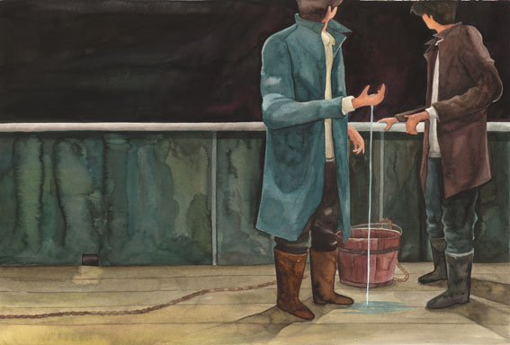

This juxtaposition between the story written by Salgari and the recent Gulf of Mexico facts, more than being a very clever and innovative idea, results deeply respectful of the philosophy that is the grounds of Salgari’s narrative in matters of getting inspiration from current affairs, and in matters of representing technological expansionism carried out regardlessly, a trend that, as it seems, hasn’t stopped with the end of the 19th century.


It also has credit for actualizing the story, to bring it nearer in all its unlikeliness to a reality we know far too well, leaving intact Salgari’s taste for danger and adventure.


I believe it was a consciously risky choice, dictated by a strong civic and environmental feeling , it’s by the way an effective way to let young people approach the consequences of what Tropea calls: "...la espansione del progresso (la rapina anche, e la prevaricazione) ad opera dell’uomo occidentale..."*


Caimmi’s wonderful watercolours fill the pages with vigour and awareness. The wave that slowly takes shape and then almost entirely floods the page, premonition of imminent disasters, seems to obscure every surface: sky, sea, ship, men reduced to mere shadows melting in the light of the fire. But the morning comes, the island has disappeared in the depths of the ocean, and the fire is all over...


Everything seems to gain back its original shape, its consistency, the night in its sinisterly sparked mantle leaves place to reality with all its tragic truth.


Bitter words resound:

“...
Una fortuna da raccogliere, e gli isolani non si lasceranno certo scappare una così bella occasione!” ***

even bitter when the fortune they can get is a staining and suffocating oil spot. In the text Salgari refers to the fish that died because of the heat of the waters as a consequence of the island burning, while in the images Caimmi has painted make us think of a sad, though concrete, paradox: the black gold, source of wars, of political and economical strategies, gets out of control and invades nature, dragging away precious balances, while common men are left with a desperate and meticulous fishing in the effort to reduce damages as much as possible.


The picture book ends with this wonderful image, no words are needed to describe such a scene:


An extremely well done book, as in the tradition of this publishing house, the careful use of graphics enhances the connection between words and images. A priceless lesson for those who want to teach to their sons (or students) the due respect for environment.

Luca Caimmi, is al illustrator from Marche, he has received several recognitions amid which the Prize titled to Andrea Pazienza, he was selected as well at the Bologna Book Fair in 1998 and 1999. He has published several titles amid which, La Nave by Antonio Koch, in 2009 with Topipittori and, in 2010, he took part to the collective exhibit titled Banchi di Nebbia, Orecchio Acerbo has published the catalogue. Here is his blog:   http://lucacaimmi.blogspot.com/ 


* Mario Tropea, Emilio Salgari, un "classico" della letteratura italiana, Agorà VII (a. II, Ottobre-Dicembre 2001)
"... we can as well affirm that the reasons of the interest in Salgari’s works derives from that ability of his to interpret, at a direct and aideological level - as the pedigreed and instinctive author he was, “elementary”, exactly, and far more convincing for this - the tendencies and myths of reality in the 1800, as exoticism, or the dream of conquest and motion, worldwide diffusion, planetary appropriation, the expansion of progress (its robbery as well, and prevarication) that western men imposed on the rest of the world.  ..."

** "...the expansion of progress (the robbery as well, and the abuse of power) operated by western men...", Ibidem.


*** “... A fortune to harvest, the people from the islands won't certainly miss such a good occasion!"


Copyright© text and images, Ed. Orecchio Acerbo 2011. Images have been reproduced with the publisher’s permission, any unauthorized reproduction being strictly forbidden.

Tuesday, 26 April 2011

Et Pourquoi Pas Toi? - Editions Notari

Et Pourquoi Pas Toi? by Madalena Matoso, Editions Notari, 2011

Hello everybody !

Today I shall tell you about a beautiful picture book for younger children even if, if I think of it better, it’s a book for all ages. It’s one of Notari's last publications, I discovered it during the Bologna Book fair and that I am now happy to share with you. Notari is a small and eclectic publishing house from Switzerland that is run by the nice couple Luca and Paola Notari (of course).

For a start I would like to talk a bit about the author of this book: Madalena Matoso. Illustrator and author, Matoso is one of the founders of Planeta Tangerina, an interesting publishing atelier that has produced several picture books of great interest, suffice it to take a look at their catalogue to realize it. Madalena Matoso’s books are not new in Italy, in fact with Topipittori publishing she has two titles: Quanti Siamo in Casa and Quando Sono Nato, that have been published as well in French by Notari under the titles Chez Moi Nous Sommes and Quand je suis né, together with Se Balader. Only one title has been translated and published, this year, in English: When I was Born, published by Tate Publishing. Matoso has received several recognitions amid which the CJ Picture Book Award, furthermore in 2008 she was selected for the 28th Edition of the Exhibit "Le Immagini della Fantasia" in Sarmede.

But let’s talk about  Et Pourquoi Pas Toi? !

The book is wordless, its structure very simple and clever:


as you can see, despite the imperfection of my picture, the book has a cut at the middle of the pages, separating the tables in two mobile straps, images are consequently modular. Translation in images of the surrealist idea of the cadavre exquis (or exquisite corpse), of which another beautiful example is the Bestiaire Universel du Professeur Revillod, this book plays with image narration, though it maintains shapes and colours apt for a younger audience: clear cut images, on a white background, geometrical shapes, basic colours, image composition isn’t very complex though detailed; characters, outlined in a simple way, correspond to reassuring logics and are easily read.

In order to obtain a functional mechanism, on the left hand side all characters are dressed in red, while on the right they are dressed in blue, here below are a couple of examples:


Not only: image composition has been studied so as to give continuity to the upper and lower parts of the pages therefore, thanks to the use of simple geometric shapes, any combination you choose, page-cuts always correspond to a finished and following image, that sometimes leads to magic implications...


others simply fun ones


The declared topic of this book is beautiful and important: it tells of equality between men and women. In theory it’s a very complex topic to deal with though, thanks to the mechanism of mobile straps, all difficulties seem to disappear, there’s no need for words to explain, you just need to turn the page, the meaning is intuitive and immediate. This is how we end up meeting men and women doing the most varied jobs: women scientists, farmers, magicians or rock stars (see above), and men doing baby-sitting or just taking care of their sick kids, or primary school teachers...


Exactly because of the wide range of possible combinations, there are no age, nor sex limits. More: to a closer analysis the message goes far beyond equality between men and women, as in this gorgeous book there are no ethnical limitations: be you white, black, yellow or blue, you can do all you want. It’s the representation of an ideal world where I would want to live as well.

Created in collaboration with the Department for Social Cohesion, Youth and Sports of the town of Geneva, this book is an important tool for modern children from any nation: the idea of equality amid sexes and races is never learned soon enough, especially when society is subject to quick and important changes, like nowadays, especially when integration is a daily, urgent, issue. Maybe, with a book like this, children (or future adults) will learn not to look their neighbour with suspicion, and they will be able to give course to new perspectives for everyone.

Shortly: an international book for modern children! What else could you wish for?


I can already hear them: "is this a job for girls


                                                                                                                         or for boys?                                                                       
how about this one?


and this?"


P.S. I received the book from the Publishers upon selection at the Book Fair in Bologna, I thank them for their kindness and precious collaboration.


Copyright© text and images, Ed. Notari 2011. Images have been reproduced with the publisher’s permission, all unauthorized reproduction is strictly forbidden.

Monday, 18 April 2011

Favole di Esopo - Topipittori

Fables by Aesop, illustrations by Simone Rea, translation by Bianca Mariano*, Topipittori Editore, March 2011

I had been waiting for the publication of this book for about a year, I had fallen in love with  Simone Rea's artwork at first glance and since then, at regular intervals, I asked Giovanna and Paolo for some news about the book. I must have been a real pain in the neck!

The book was finally published in March, right before the Bologna Children's Book Fair, and to confirm how strange life can be, a few weeks before I had personally met Simone in Rome, during a wonderful laboratory at Orecchio Acerbo Publishing house.

But let's start with order, because today we're talking about what is considered the forerunner of modern fables, and this deserves at least a short introduction.

During the centuries, Aesop's Fables have been translated several times - from Greek to Latin, to medieval versions in vulgar (Isopet or Ysopet) – and revisions; in some cases we could as well say they were re-written, as it was the case with Jean de La Fontaine who rewrote them according to the needs of his times. Also from the iconographic point of view, the Fables have been the source of several interpretations: from the famous New York Public Library's Esopo Mediceo to the one from Augusta, dating the end of 1400, up to the very famous children's version, titled Baby's Own Aesop, by Walter Crane dating 1887, not to forget Milo Winter's and Arthur Rackham's dating the beginning of 1900. To end this quick excursus let me mention one last masterpiece: the interpretation Antonio Frasconi gave of the Fables, for those who can read Italian, Publisher Topipittori wrote this beautiful post on its blog. Several diatribes regarding Fables' paternity took place in time and space: in fact, to its primeval nucleus several additions were made in later epochs, imitating their style, in some cases metrics as well, to the point that the identification of the original Fables became quite difficult to evince. To this purpose I suggest you to take a look at the Fables Pedigree you can find here and to read this article where their classification is thoroughly explained **.

We could talk about Aesop's Fables for days, but let's get to our times because, as it seems, the attention towards this literature's classic hasn't decreased: as an evidence to what I'm saying, let me mention the recent version published by Milan Presse with artwork by Jean-Francois Martin, that was awarded with the Fiction Bologna Ragazzi Award, and the beautiful version object for this post.

For a start, please allow me to make a short evaluation on the Fable's selection the publisher made: we're talking 20 fables, for each one we have a double page spread; amid the selected Fables we find some famous texts, such as The Town Mouse and the Country Mouse, The Cat and the Mice, The Fox and the Grapes, together with less usual ones such as The Donkey and the Mule and The Crab and its Mother. A refined selection that has been clearly meditated at length.

And now let's talk about Simone Rea's artwork!

                                                                            The Lion and the Dolphin

The first thing that strikes me while looking at those illustrations is the use of colour: even though there is not much space left for white, Rea's tables are sober and elegant. His colours, peculiar and wisely measured, fill the glance and give us a sense of time suspension: the seraphic azures, at times clear others more material, copious or transparent reds, or the more neutral nuances to whom the illustrator gives the task to soothe the turmoil resulting from other colours. If you notice, white appears in the details: in the dolphin's dress light lace above, or in the chair in the illustration that follows, in the dresses' collars or in the t-shirt and in the frog's face from the last illustration. Another aspect that meets my taste in particular is Simone's sensibility for material, for the scratched, scraped off stroke, that often gives images with a modern tone an air of something more consumed, as if we were observing a film worn by the many projections, as if to underline the infinite repetition of these stories, indirect recall to the Fable's ancient life.

The Monkeys and their Mother

Another important aspect that needs be taken into consideration about Simone’s images is their composition. In fact, in order to maintain a sense of space and lightness, and of course to allow text inclusion, where narrating elements are composite, the heart of image narration plays all around structures that tend to agglomerate, giving to the tables background the task to soothe the scene and to create enough space to insert the text. Framings, always accurately distinct, give reading its rhythm and liveliness. I would also like to emphasize Rea’s incredible synthesis capability when narrating: even if it’s true that the Fables don’t have large texts, on the contrary most of them do have a very succinct one, it is also true that some of these stories entered popular tradition in many countries and, consequently, were enriched with a particularly important cultural and iconic inheritance. Our illustrator’s ability, to my opinion, consists in having inserted with discretion and intelligence some archaic elements re-elaborated in a more topic key.

The Gnat and the Bull

Let me clear this point: Fables, where they formed part of popular cultural patrimony, at first had a purely moral task and, only in a second moment, a pedagogical one, especially from the moment they were designated as an essential element in children’s educational equipment; in both cases the parallel between animal’s and human behaviours is perfectly clear, as much as it’s clear these behaviours were used as an example to communicate a common sense lesson. While observing Rea’s tables it appears quite evident how his playing with some elements, as for instance clothes used to dress animals as if they were men (not a new expedient but still used with remarkable skill), or the insertion of modernity cross-references (I’m thinking for instance at the puzzles magazine you find in The Monkeys and Their Mother ‘s image above, but also at the digital camera in The Frogs' Complaint against the Sun just to name a couple), do contribute in a decisive way to the reader’s identification process and, as a result of this, to an easier assimilation of the message contained in the text. It’s curious to observe how a similar process, in specific animal’s clothing, applied by two contemporary artists, almost the same age, may generate such distinct results: if we take Martin’s Fables illustrated for Milan Presse, and we compare them to Rea’s, we can recognize the similarity of intents that differs in the way these are filtered by the artists both in the chromatic choice, minimal in Martin’s tables, more complex in Rea’s ones, and in the settings: decidedly more retro for the French and more contemporary for the Italian. We’re talking here two excellent interpretations, no doubt. Were I forced to find a small flaw, I would instinctively think that the amazing artworks produced by Martin might be less immediate to a younger reader, that the refinement of his tables, and their reference to artworks from the first decades of the 20th century, might risk to lose that feeling of empathy I fully find in Rea’s artworks. It’s though appropriate to remind that children aren’t a single entity and that, any single one of them perceives and filters images according to his/her own sensibility, therefore my digression right above might be completely useless: what stands out, in the end, is the amazing work they both produced.

One last note goes to the book’s flyleaves: perfect anteroom for what we will find in the internal pages, inhabited by animals-children simply outlined with pastels, gently laid on the page, ready to lead us into this archetypal travel and to bring us back to where they found us, maybe slightly different.

If you’re curious to know more about Simone Rea, you can take a look at his blog.


*    with the exception of The Crow and the Fox, done by Topipittori.
** just for complete information, and if you can read Italian, let me signal as well this extract from Confessioni e battaglie by Carducci where, at point III, he tells about "l'Esopo senese curato dal Targioni e dal Gargani" [Aesop from Siena edited by Targioni and Gargani] that was published by Le Monnier in 1864.


Copyright© text and images, Ed. Topipittori 2011. Images have been published with the Publisher’s permission, any unauthorised reproduction being severely forbidden.

Monday, 21 February 2011

The Wild Swans - Topipittori

The Wild Swans by Has Christian Andersen, illustrations by Joanna Concejo, translation by Maria Giacobbe, Ed. Topipittori, February 2011


Every time I open up a book illustrated by Joanna Concejo my wrists start shaking with emotion, for how deeply her images arrive to my heart with no filters nor inhibitions. It's beyond my control, an emotional wave overwhelms me entirely, leaving me breathless, as if the most beautiful and sad memories came out of their tidy drawers all at once and started dancing all over my body.

When I learned that Giovanna and Paolo, our Topi, had assigned her one of the most beautiful and difficult texts by Andersen I deeply rejoiced, and not because I'm sadistic: this was one of the stories my granny used to tell me more frequently and I couldn't wait to plunge into the interpretation Joanna would have given of it.

It's not easy to confront with a classic, least of all if the classic is signed Hans Christian Andersen, because the psychological complexity of his tales is heavy, because rendering his melancholic and poetical atmospheres is extremely difficult, because the harshness of his stories seems at times hopeless (I have vivid memories of the anguish I felt when, child, I read The Little Mermaid). Giving essence to such a refined and restless soul is not simple.


This tale, in particular, is extremely complex because it represents the fall from childhood's paradise towards the abyss that goes along with adolescence, between disenchantment and inability to communicate, between the loss of one's nearest and dearest and the desperate effort of bringing them back.

The main character, Elisa, is alone. Left to her own devices, every minute of her life is spent in the memory of her beloved brothers, that she will find again only almost adult, and of the nice moments spent with them. As in almost all traditional tales, advocate of the fall is the cruel stepmother who alienates the children from their father condemning them to an imposed silence, deriving from the mutation into swans for the sons and from the forceful separation for Elisa.


As suitable to an appropriate tale's hero, Elisa is at first a child and then a young woman of great virtues: beautiful, polite, with a firm faith, she places her and her swan-brothers' destiny in the hands of Divine mercy, scrupulously following the precepts she's being given without a doubt, with no sinking. Despite physical suffering, caused by the nettles she's obliged to spin to make the shirts that will break the witch-stepmother's spell, despite all the risks she runs, the young woman will bring her task to the conclusion assuring her brothers and herself the longed happy ending.


Joanna has given an amazing interpretation of this tale, full of symbolic cross-references and noble moments. Her illustrations reaffirm Elisa's loneliness in several ways, as it happens in the image here below, where the nettles form a sort of frame/prison that isolates the beautiful princess from the rest of the world:


Depicted from behind, bent on her own piece of work, the young woman looks like a twig bending over to life's moodiness: she doesn't address us while we observe her, she can't say a word, otherwise her brothers would die.

I would like to recall your attention on the first image of this post, on the mirror-image portraying the shape of a swan to be precise, because this illustration recalls with great strength the idea of presence/absence of the brothers: on the left side of the image the swan looks like a ghost, only vaguely sketched, and the little character in the distance, as big as a little speck, represents young Elisa wondering with no precise intent, looking for those she can feel without really seeing; on the right side nothing is left of the swan if not its negative, the silhouette, almost as if to remark the ideas of distance, unattainability, absence.


Absence, together with desperation for the impossibility of carrying on the task of weaving the eleven shirts, is recaptured in this image as well


where, to a more descriptive part where we can see tiny knights galloping towards the castle whose king has decided to take Elisa with him and to soon marry her, is powerfully opposing the image on the right, a portrait of the young woman, visibly hopeless, whose image is at times eclipsed by those embroidered disks, transparent, appearing as well in the flyleaves of the book. The presence of those objects seems almost to be emphasizing the sensation of emptiness that overwhelms the girl when she is parted from her brothers, her body is almost maimed, erased, at the same time the shape and the positioning in flock the illustrator gave those disks seems to be recalling the idea of travel and the temporary nature of the situation.


In the last illustration I propose, once again Elisa turns her back to us, once more she appears as the solitary hero, framed by the crowd that between fury and incredulity besieges her


Only favourable wardens the birds, observing the scene at a distance, as if to symbolize the benevolent glance of heavens.

To end with, please observe the wonderful harmony of Joanna's tables, drawn using pastels, their balance in the use of colour, the gentleness of her stroke.

Beautiful the translation by Maria Giacobbe.

This book doesn't cost "half of the kingdom", it doesn't even cost as much as Elisa's precious book therefore, if I was able to arouse your curiosity, I suggest that you to pay a visit to the bookshop (or to the publisher's website).


The book has been published simultaneously in french, for Editions Notari.


Copyright© text and images Topipittori 2011. Images have been reproduced with the permission of the publisher, all reproduction is strictly forbidden.